| Vancouver Off-Topic / Current Events The off-topic forum for Vancouver, funnies, non-auto centered discussions, WORK SAFE. While the rules are more relaxed here, there are still rules. Please refer to sticky thread in this forum. |
 | |  08-19-2009, 01:56 AM
|
#26 | | Even when im right, revscene.net is still right!
Join Date: Sep 2007 Location: richmond
Posts: 1,381
Thanked 1,958 Times in 287 Posts
Failed 630 Times in 86 Posts
| | 
|  | |
08-19-2009, 01:57 AM
|
#27 | | Banned By Establishment
Join Date: Aug 2005 Location: Burnaby
Posts: 2
Thanked 266 Times in 124 Posts
Failed 450 Times in 132 Posts
| Quote:
Originally Posted by ZhangFei  what do you guys use to make logos?? any programs that are easy to use? | mspaint
gimp
photoshop
*insert your picture viewer here*
| |
| | |
08-19-2009, 06:23 AM
|
#28 | | I *heart* Revscene.net very Muchie
Join Date: Feb 2003 Location: Vancouver
Posts: 3,905
Thanked 7,015 Times in 1,218 Posts
Failed 68 Times in 23 Posts
|
you guys are right, it doesn't represent a car forum or community but then again neither does the current logo with its star trek font. Like I said, I was just messing around. Thanks for your comments, I'll try to come up with something more related to an auto theme.
| |
| | |
08-19-2009, 06:31 AM
|
#29 | | RS has made me the bitter person i am today!
Join Date: Apr 2002 Location: Coquitlam
Posts: 4,846
Thanked 722 Times in 275 Posts
Failed 86 Times in 38 Posts
| Quote:
Originally Posted by Matsuda I was bored tonight and I haven't designed anything new in quite awhile after getting into photography. Thought I'd play around and give an attempt to redesigning the Revscene logo. 
thoughts? suggestions? stick to photography? |
I think you need to emphasise on REV like current one as they are two different word... Quote:
Originally Posted by skyxx Here guys I mocked one up to counter Matsuda's.   | GG  | |
| | |
08-19-2009, 06:53 AM
|
#30 | | I only answer to my username, my real name is Irrelevant!
Join Date: Oct 2002 Location: CELICAland
Posts: 25,688
Thanked 10,397 Times in 3,920 Posts
Failed 1,390 Times in 625 Posts
| Quote:
Originally Posted by Matsuda you guys are right, it doesn't represent a car forum or community but then again neither does the current logo with its star trek font. Like I said, I was just messing around. Thanks for your comments, I'll try to come up with something more related to an auto theme. |
what are u talkin about the current one totally represents a car forum
the black rev is ashphalt the white scene are the white lines on the road, and the red glow is the red light where we all rev our engines | |
| | |
08-19-2009, 08:55 AM
|
#31 | | I contribute to threads in the offtopic forum
Join Date: Jul 2009 Location: ur sistrs pants
Posts: 2,656
Thanked 606 Times in 105 Posts
Failed 342 Times in 57 Posts
| Quote:
Originally Posted by skyxx Here guys I mocked one up to counter Matsuda's. | best one so far  | |
| | |
08-19-2009, 09:22 AM
|
#32 | | Hypa owned my ass at least once
Join Date: Mar 2002 Location: Japan
Posts: 6,745
Thanked 1,314 Times in 540 Posts
Failed 124 Times in 79 Posts
| Quote:
Originally Posted by Matsuda you guys are right, it doesn't represent a car forum or community but then again neither does the current logo with its star trek font. Like I said, I was just messing around. Thanks for your comments, I'll try to come up with something more related to an auto theme. | Yeah but the current logo has been around so long, with many a merchandise bearing its current design in that timespan. I think with almost a decade in longevity, it's almost iconic to some and any change or deviation would feel strange and unresvscene-like.
| |
| | |
08-19-2009, 09:30 AM
|
#33 | | Banned (ABWS)
Join Date: May 2008 Location: B.C.
Posts: 2,039
Thanked 101 Times in 57 Posts
Failed 44 Times in 20 Posts
|
i like OP's idea.. the logo looks alive..
just needed some edit and modify
| |
| | |
08-19-2009, 09:55 AM
|
#34 | | Circle Stick Square Mod
Join Date: Sep 2005 Location: Burnaby
Posts: 4,934
Thanked 249 Times in 114 Posts
Failed 21 Times in 13 Posts
|
lol give that logo to the RS comp fourm
__________________
91 240sx (Sold)
86 FC3S (Sold)
99 Civic
 | |
| | |
08-19-2009, 11:22 AM
|
#35 | | Media Officer / MOD
Join Date: Apr 2001 Location: vancouver
Posts: 28,087
Thanked 5,770 Times in 1,732 Posts
Failed 86 Times in 64 Posts
|
1st one's kinda iffy
2nd's the truth
| |
| | |
08-19-2009, 02:29 PM
|
#36 | | ESKETIT
Join Date: Feb 2004 Location: Shambhala
Posts: 23,376
Thanked 9,704 Times in 2,330 Posts
Failed 998 Times in 241 Posts
| Quote:
Originally Posted by MWR34 | that is so epic, can i buy that anywhere locally?
| |
| | |
08-19-2009, 02:30 PM
|
#37 | | I WANT MY 10 YEARS BACK FROM RS.net!
Join Date: Jan 2006 Location: Abbotstan
Posts: 20,721
Thanked 12,136 Times in 3,361 Posts
Failed 1,848 Times in 413 Posts
| Quote:
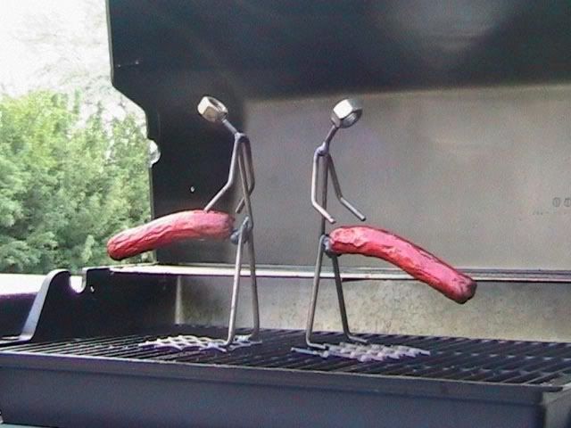
Originally Posted by nickmak looks like a sperm and an egg to me. just being honest | 
Maybe that's appropriate for this sausagefest...
__________________ Quote:
Originally Posted by Godzira Does anyone know how many to a signature? | ..
Quote:
Originally Posted by Brianrietta Not a sebberry post goes by where I don't frown and think to myself "so..?" | | |
| | |
08-19-2009, 02:40 PM
|
#38 | | Willing to sell a family member for a few minutes on RS
Join Date: Feb 2005 Location: Surrey
Posts: 12,760
Thanked 689 Times in 376 Posts
Failed 61 Times in 38 Posts
| Quote:
Originally Posted by MWR34 | sweet
| |
| | |
08-19-2009, 07:03 PM
|
#39 | | Chinese Guy, Swedish Rides
Join Date: Jan 2004 Location: In da GV-ehhhh
Posts: 11,821
Thanked 611 Times in 203 Posts
Failed 57 Times in 28 Posts
| Quote:
Originally Posted by skyxx Here guys I mocked one up to counter Matsuda's. | Screw you for not giving me credit for that pic. See? I knew it'd come in handy.
In all seriousness, I liked Matsuda's concept. I thought the thing on the left was the tach needle within some windy roads....but it turns out that wasn't the case. Or something.
| |
| | |
08-19-2009, 07:58 PM
|
#40 | | Unofficial Tin Foil Hat Specialist.
Join Date: May 2008 Location: Vancouver
Posts: 8,150
Thanked 1,529 Times in 604 Posts
Failed 326 Times in 125 Posts
| Quote:
Originally Posted by +Kardboard+ Screw you for not giving me credit for that pic. See? I knew it'd come in handy.
In all seriousness, I liked Matsuda's concept. I thought the thing on the left was the tach needle within some windy roads....but it turns out that wasn't the case. Or something. | Oops, I was going to. I don't know why I didn't... But anyway, yeah that awesome background picture belongs to Kardboard!  | |
| | |
08-19-2009, 11:34 PM
|
#41 | | My homepage has been set to RS
Join Date: Dec 2008 Location: Vancouver
Posts: 2,308
Thanked 825 Times in 341 Posts
Failed 203 Times in 77 Posts
| Quote:
Originally Posted by Matsuda I was bored tonight and I haven't designed anything new in quite awhile after getting into photography. Thought I'd play around and give an attempt to redesigning the Revscene logo.
thoughts? suggestions? stick to photography? | i wouldn't say "stick with photography", but not a fan of this particular one. I think it's a bit too similar to the orange country chopper idea...and kinda reminds me of that and motorcycles. Also think it's not simple enough and not a fan of the fonts and colours. But it usually takes shitloads of tries before coming up with something good so it's all good! Quote:
Originally Posted by skyxx Here guys I mocked one up to counter Matsuda's. | i like it...it represents humanity's struggle to survive and mirrors the everlasting struggle for world peace and mo'fucking hot dogs
| |
| | | |
 Posting Rules
| You may not post new threads You may not post replies You may not post attachments You may not edit your posts
HTML code is Off
| | |
All times are GMT -8. The time now is 03:18 PM.
|
 You are currently viewing our boards as a guest which gives you limited access to view most discussions and access our other features. By joining our free community you will have access to post topics, communicate privately with other members (PM), respond to polls, upload content and access many other special features. Registration is fast, simple and absolutely free so please, join our community today!
The banners on the left side and below do not show for registered users!
You are currently viewing our boards as a guest which gives you limited access to view most discussions and access our other features. By joining our free community you will have access to post topics, communicate privately with other members (PM), respond to polls, upload content and access many other special features. Registration is fast, simple and absolutely free so please, join our community today!
The banners on the left side and below do not show for registered users!